Suggestion
David, how about a ‘back to top’ button at the bottom of a thread? Not normally an issue, but some of the trip reports contain loads of images (great!) and with the drag-and-drop functionality this will probably increase (even greater!). BUT, scrolling back up can become a right royal PITA on some of these threads.
Here’s a suggestion that has nothing to do with the update as such but could be a nice improvement:
On the homepage, the most recent posts are shown with their headlines and a preview. The preview would ideally contain some lines (i.e. the first lines) of the new post. Technically, it does. Practically, it often contains the first lines of the quoted text that a post is a reply for – without the quote marks. It creates the impression that the poster (as shown with his avatar/picture on the right) has written the lines shown as a preview.
How about changing the preview to show the first lines of the “new” text, omitting anything that’s clearly a quotation of a previous post?
I find that on the iPad the “Active” link is too small and usually requires multiple clicks to activate
David, how about a ‘back to top’ button at the bottom of a thread? Not normally an issue, but some of the trip reports contain loads of images (great!) and with the drag-and-drop functionality this will probably increase (even greater!). BUT, scrolling back up can become a right royal PITA on some of these threads.
Good idea. We’ve implemented this and will release it shortly. FTR, I believe in most mobile browsers you can double tap near the top of the screen to whizz back to the top, but a button makes sense anyway.
How about changing the preview to show the first lines of the “new” text, omitting anything that’s clearly a quotation of a previous post?
Another good idea – it has bothered me before, but I didn’t think it came up that often. If it was often enough for you to notice then it’s worth fixing. Again, we’ve done it and will release soon.
I find that on the iPad the “Active” link is too small and usually requires multiple clicks to activate
We’ve radically improved the layout on mobile devices; there is a major flaw to fix on the iPad which we’ll do first, then we’ll look at making this a bit bigger. Remember you can tap the word “Active”, not just the icon.
Nice work!
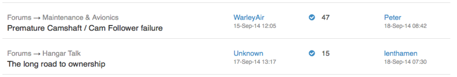
Just a small bug – it seems that authors whose user name contains a space are rendered as “Unknown” in the list of recently active threads, as seen below:
And BTW, that drag ’n drop feature for images in the post is really great!
Might just be a coincidence but it looks like topics started after sometime on the 16th September as listed as being started by “Unknown”. The link still goes to the correct profile, so it’s obviously not strictly true. :)
Thank you cloudhead and cormorant. A couple of others mentioned that bug and I thought it had been fixed, but evidently not. I’ll chase it up.
Might just be a coincidence but it looks like topics started after sometime on the 16th September as listed as being started by “Unknown”. The link still goes to the correct profile, so it’s obviously not strictly true. :)
(and others).
“Unknown” issue sorted now.
Either I missed something, or the “strike-through” feature is unworkable. I tried it in my recent (ahum) contribution to http://www.euroga.org/forums/hangar-talk/2916-bo208-junior#post_46131 , enclosing the naughty part in dashes – but it showed up in its natural state, and no change with two or three dashes.