I’m sure quite a lot of this is because the user interface design is somewhat lacking in certain avionics
Definitely, I find the G1000 and 430/530 an awful user interface. The GTNs are a lot better in this respect.
If Tektronix can make an oscilloscope I can turn on and use without ever opening the manual, then surely the avionics manufacturers can do
It took Tektronix one or two generations to get there. And Tek didn’t have to certify their software…
If Tektronix can make an oscilloscope I can turn on and use without ever opening the manual,…
But this is, because the oscilloscope has an ”AUTOSET” button (at least my Chinese clone has that) which produces a reasonable and readable display within a second. I am told that most modern glass cockpits have something similar. Ours (second generation Honewell) doesn’t , but in order to operate it correctly – not just the displays with their very limited capability but the whole system which also includes radios, flight director and autopilot, radar, FMS, … – a ground course lasting several days is absolutely required. Neither the manuals nor the systems are suitable or intended for self-study or intuitive operation. They simply were not designed for that. The same, but to a lesser extent, applies to the Garmin 1000. I know a type rating instructor for the Citation 510 (Mustang) who will only train pilots on the aeroplane who have taken a three day Garmin 1000 ground course beforehand, no matter what their background is.
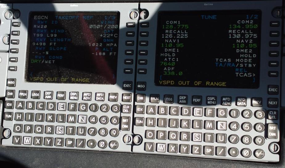
To find the list of nearest airports on the Avidyne glass cockpit you have to turn the left knob of the MFD until “NRST” is highlighted …
Neither the manuals nor the systems are suitable or intended for self-study or intuitive operation. They simply were not designed for that. The same, but to a lesser extent, applies to the Garmin 1000.
Yes – but that is the problem, isn’t it?
I’m battling with myself if Garmin or SAP (who makes enterprise software, for those few of us NOT working in IT) have the least amount of respect for the end user.
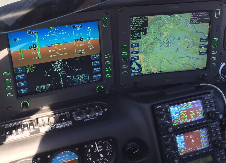
At the rental outfit where I usually get the airplanes from, I have a clear preference for the G1000 equipped C172 SP compared to the really old ones. Mostly because they just look & feel saver to the average passenger and even I personally like how the 2010 built model “feels”. It somehow feels stiffer, more precise in flight – not sure if that’s an illusion or down to actual wear and tear of the older ones. I also like how the GFC700 is seamlessly integrated into the G1000.
But the usability of the G1000 (and same goes for the G430, really) is just awful! I don’t fly it that often and I have to rethink how to do certain things (entering a flight plan.. which knobs do you turn – to shift to the next letter, next waypoint, go back, enter a letter, etc. – the small one or the big one?). Why do you adjust the pilot/copilot volume using ONE knob and an inner knob? Why not a left knob and a right knob which EVERYONE understands automatically?
It takes hard work to design intuitive user interfaces but it can be done. Love it or hate it, but Apple knows how to do it.
The same, but to a lesser extent, applies to the Garmin 1000. I know a type rating instructor for the Citation 510 (Mustang) who will only train pilots on the aeroplane who have taken a three day Garmin 1000 ground course beforehand, no matter what their background is.
I agree to some extent. The G1000 is easier for self study but it is still a very challenging system and by no means intuitive. Moving from the piston Avidyne Mirage to the turbine Garmin Meridian, the most challenging aspect was the avionics. I played with the simulator, did a good online course and a few days in the air with the instructor transitioning me.
It is not a system you can get in and blast off IFR if unfamiliar. But so what? It was designed a long time ago now – the new Garmin stuff is a lot better but will still take a lot of time to learn.
How many of you have seen the Collins Pro-Line?
Initially it is totally opaque and I would challenge anybody to work out even the most basic things in under a day 
In the GA world, you would be laughed at if you introduced a textual interface like that…
But when you see an experienced pilot operate it, you can see why they like it. It’s very fast to use and very powerful.
So, somebody has to make a decision as to what intellectual level of audience is to be catered for, and clearly you can’t cover the lowest common denominator if that is somebody who only just managed to get a PPL.
Peter, you’re suggesting a trade-off between intuitive handling and powerful and fast usage for experienced (or equipped with more intellectual capital…) users.
I find the text entry among other things on the G1000 neither intuitive for the beginner nor efficient for the professional. In my view, it could simply have been designed better.
I fly 2 different Proline21 aircraft and agree with Peter. It took me a long time to get to grips with it though.
I suspect that What Next feels the same about his Honeywell system, with all these systems once you know how to use it the system is very capable.
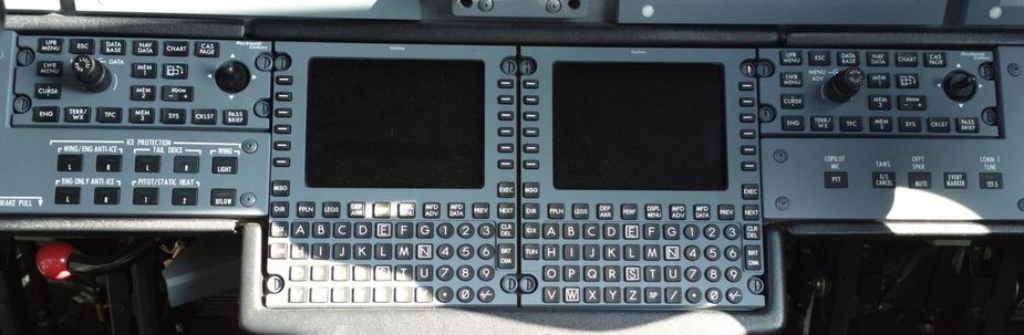
In general the whole system works like this: Press the “LSK” (Line Select Key) next to the setting you want to change and turn the knob beneath – on the PFD. And then there’s some simply shortcuts like pressing the right knob to set the QNH to Standard (after pressing Baro Set). On the MFD you turn the left knob to call up the page you want and press the LSKs to change the setting of the feature next to it.
The two windows on the left and right side of the MFD (engine data and navigation data can be configured as needed. And in the PFD you have small window for air data and one for engine data.
That’s it.
I would teach any of you to fly it safely VFR in 2 hours, I promise.
The G1000 is like MS Word: Let’s put all the functionality imaginable in there and make it as cryptic as possible. Never mind the fact that 99% of the users only need 1% of that functionality. A Dynon is at least 50 times simpler to use, and relatively intuitive.
A well designed interface should require knowledge about the aircraft functionality/systems only, not “knowledge” about the interface.