They show the situation on the surface.
The Q is how far out they are for say FL100-150?
In the alps: not much, because that’s about how high the surface goes. Or isn’t this question about the LOWZ trip?
It was a general question. I often find the charts are out and something like this would not help.
According to Karl Heinz Hack, the vertical cross section of a warm front from ground to tropopause is about 800 to 1500km wide, that of a cold front about 400 to 800km. That would suggest that the Altostratus on ~FL100 is maybe 250 to 500km ahead of the MSLP, and the Altocumulus maybe 100km. But then again there’s seldom a typical front…
They’re not misleading, they’re simply only one part of the picture. A look at the 500 hPa flow gives you an idea of what’s going at around 18k feet.
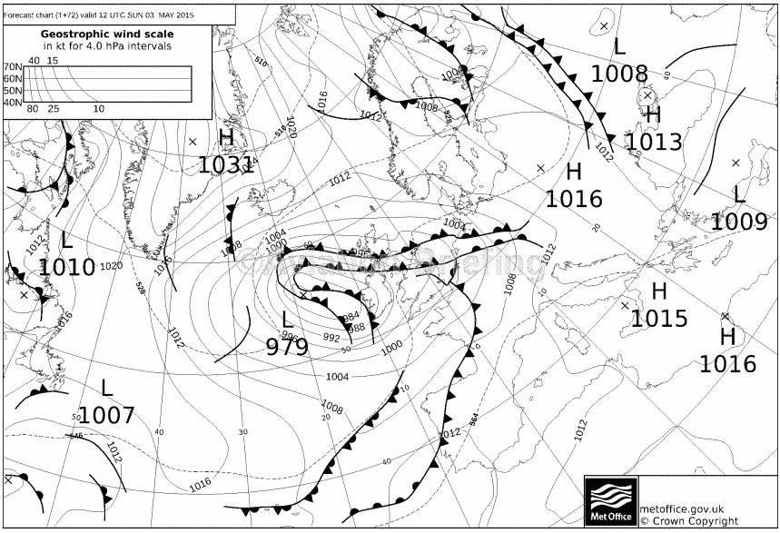
Today, there was naff all wind at the surface, but a howling gale at around FL180. Those front positions
look pretty good though – I flew through them both ways around lunchtime!
What issues did you have with the met data today?
I flew through them both ways around lunchtime!
What aircraft was that in?
What issues did you have with the met data today?
None – I was at home 
In a Learjet at FL180 with two pairs of eyes glued to the Radar!
I just wondered if you’d experienced anything in particular today to put the thought in your head.
When I was taught meteorology when I was young and foolish, our lecturer spent about 15 minutes of his hour lecture giving us a synoptic view of European then global weather. He would start with the MSLP, then head onto 500hPa, skew Ts, SigWX, thickness, and so on in great depth, in the same way you put together your various inputs for IFR weather decision making.
Airline briefing packages are awful in this respect – they give you a current METAR, the TAF, SigWx and a few wind charts leaving you totally in the dark unless you take your time to look up stuff like MSLP on your own time.
The reason for me asking was that somebody told me years ago the MSLP depicts only surface positions, which makes sense of course, but the unknown to me was how much these move as you go higher. I have often found when flying that the wx is in a very different place to what the chart shows – even when using the “immediate”-timed one.
What Tom says above explains a lot of it.
Peter wrote:
What Tom says above explains a lot of it.
What Tom said is in the MET TK, which is frequently claimed to be totally useless for actual flying. 
What Tom said is in the MET TK, which is frequently claimed to be totally useless for actual flying
In a very dry theoretical way, however (in the UK, IME).
It’s one thing to learn the theory; quite another to learn how to make use of it in relation to which internet wx data is available.
I find the only really accurate things are tafs, metars, radar, sferics, and the IR images for cloud tops. The last one is not 100% because sometimes you get a thin layer at say FL300 which confuses the picture, but one can usually infer that from other data e.g. the absence of any frontal features on the MSLP, or the high altitude layer is too fuzzy. So far I have never been really caught out by the wx (within the TB20’s climb capability) but it would be nice to get more out of the MSLP charts – because they run 5 days ahead.