
What is mysterious about this?
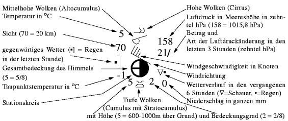
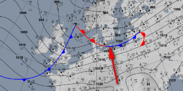
This is a surface analysis based on synoptic surface observations. Each of these plots represents a weather station.
https://en.wikipedia.org/wiki/Station_model
Takes a bit of time to get to know the factors but it should be part of the PPL meteorology to look at those.
When you do a manual analysis, you get a chart plotted with all those stations but nothing else. Then you have to draw the isobars and resulting from this the fronts e.t.c. I used to love doing it, unfortunately today it is mostly machine made. But if you do it manually, you do get a LOT of information about the weather at the time of the analysis. And the symbols become 2nd nature after a while.
This is one reason why charts can be different in details. Possibly the UK uses different stations to plot and analyze than the DWD does. Often that is enough to have different isobars, particularly if you don’t get enough information at sea or in other remote places. There are plenty of stations out there, oil rigs, buyoys delivering wx data and I am not sure if there still are weather ships, but also other ships provide weather reports.
There are several possible codes out of that wiki page which the DWD chart may be using. Does anyone know more detail?
This is the one they are using.
https://www.dwd.de/DE/service/lexikon/Functions/glossar.html?lv2=102248&lv3=102580
In German only unfortunately.
However, the station models in their main elements are WMO standard. Know one, know most of them. There are nuances but the vital stuff is all the same.
Mostly, what is useful to look at is wind and cloud cover as well as the symbols for weather and cloud if there are any (TCU/CB). We use air pressure (QFF) to analyze the charts amongst other things. Those things are standard in all the models.
OK; that looks a bit like this image in the wiki page above
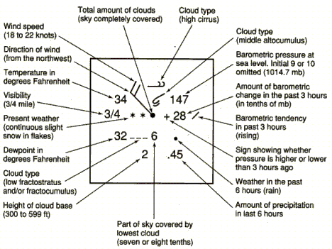
Yes exactly. As I said, this is WMO standard, not national.
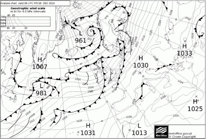
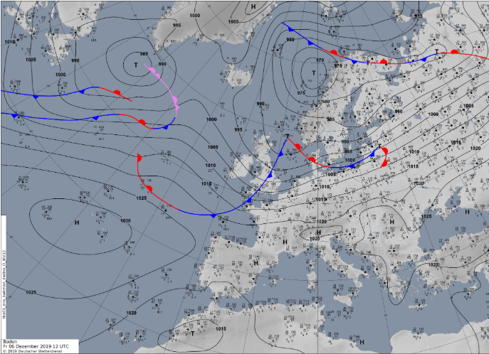
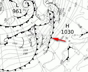
Another comparison:
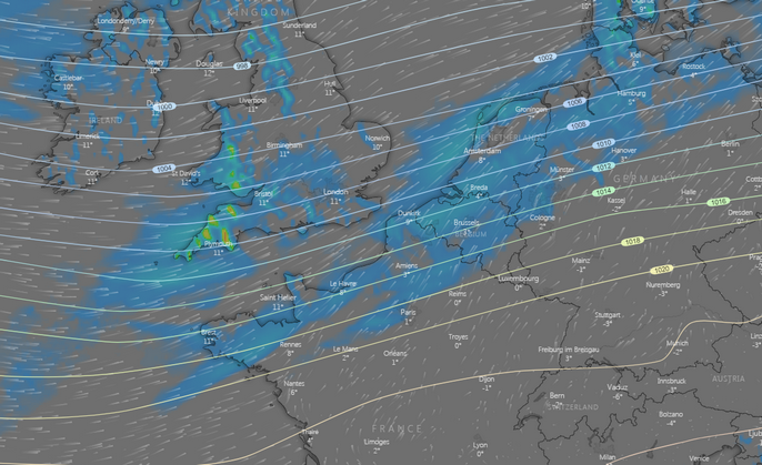
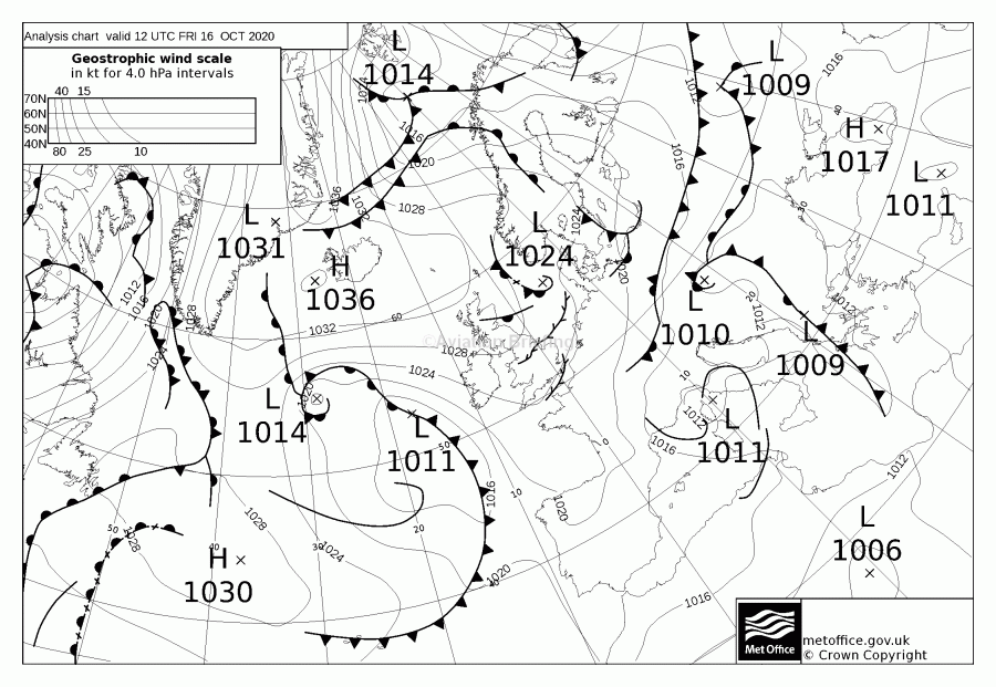
UKMO:
DWD:
WINDY.COM (NEMS model, but ICON ECMWS & GFS all agree):
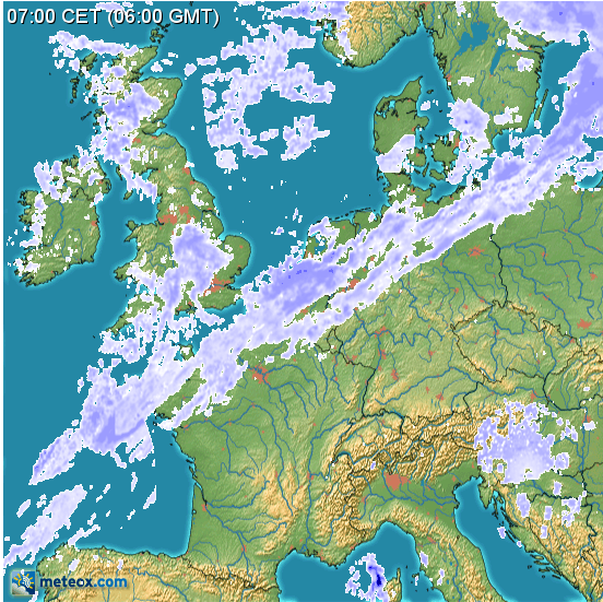
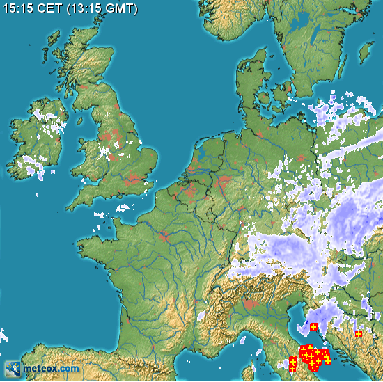
Actual, meteox.com
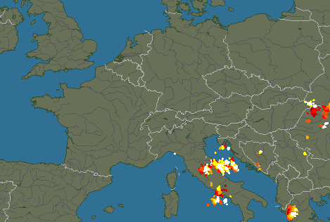
Actual, sat24 infra red
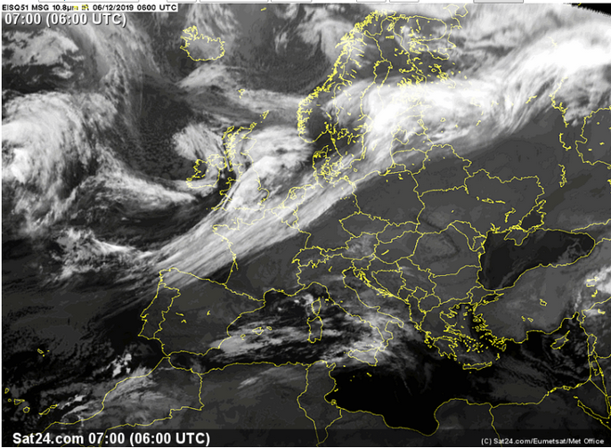
It seems to me that this feature on the DWD is missing in reality
and the DWD is missing this very prominent feature
Is “ICON” on the DWD charts
the same wx model as “ICON” on windy.com
At least the same family from the same provider (DWD). They run at least two “ICON” models:
https://www.austrocontrol.at/flugwetter/products/zamg/BK_BodAna_Sat_2010161200.png?mtime=1602851966
https://www.austrocontrol.at/flugwetter/products/zamg/BK_BodAna_Sat_2010161200.png?mtime=1602851966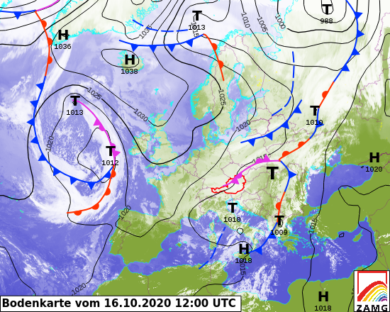
Throwing this one into the ring.. from Austrocontrol (free, btw).
The corresponding UKMO MSLP
What I don’t know is how old the Austro one is. The above one is current (“analysis”) since it is past 1200 UTC when I am typing this.
I wouldn’t say they are similar.
Looking at the radar
I’d say the UKMO chart is much more accurate because it shows the troughs which give rise to the TSRAs which you see on the radar, and the sferics


