Clearly, printed charts are dead or dying as a viable business, especially for much of Europe formerly supported only by Jeppesen’s VFR charts (abandoned in 2013) but I think you still get much better readability on the printed presentation, or obviously on an electronic copy of it.
This is probably because placing free text so it doesn’t clutter or overlap other stuff is an immensely complex software task, whereas a clever human can do it easily. Same with PCB layouts – auto component placement works only with regular object shapes.
So vector charts all have a certain “simplistic” style, which some people like and some don’t like.
I definitely prefer the vector charts as they are easily scalable, can be turned around and legible without turning your head around your neck 
The background is another story especially regarding the mountainous areas.
As for printed chart, they still offer a good backup I think and editerra (and maybe Jean Bossy later) now offer a number of maps in Europe with the same layout. They can be an option for those who want to fly VFR across borders….
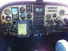
I see no use for printed maps anymore, provided you have 2 independent devices and therefore a backup in case an ipad runs hot etc. Concerning depiction, I definitely prefer vector maps and think this will be the way to go in the future.
Vector charts – it’s a no- brainer.
Most of my experience is with rastered/scanned charts in ForeFlight and I have no problem reading them. I only have very limited experience with a vector chart product (I think AirNav Pro – a Spanish pilot friend had it and we went on a couple of flights together) and found that while the airspace was clear, the terrain was not. The problem in Europe of course is that there is no standard for VFR charts, other than the abandoned Jeppesen.
Canadian and Mexican sectional VFR charts aren’t identical to FAA sectionals either…
Maybe I’m getting old, but the map is something you study. The idea is to get the information it contains into your head, at least as much as is practical along the chosen route. You use it to find good landmarks, possible emergency landing spots and so on. The operational flight plan then becomes a simple list of points. The old ICAO maps even had drawings of light houses along the coast for easy recognition.
With a GPS, your position and ground speed are no longer variables, they are absolutes and known. The navigational aspects of knowing the terrain is therefore not an issue. With the pad, and a phone (with the same software), you also have backup. Even so, it is nice to know where you fly and only a real map can give you that information.
Uhm 4 hour flight @ 175 kts that’s 700 NM of landmarks and “possible emergency landing sites” to memorize… no fkn way.
On top of that knowing where you are leaves you a lot more time to identify possible crash strips as you fly.
The FAA is moving towards a vector chart presentation, but they are not there as of yet. It will probably be a few years before they are able to provide charting data for the US in this form.
Interesting. Due to the free of charge sectionals that everybody knows by heart, the US have always been behind in moving map technology.